VISUAL BRAND LANGUAGE FOR PENTAIR
CLIENT : PENTAIR
STUDIO : IN2 Innovation
Research | Strategy | Visual Brand Language | Interface Design
Ovierview
IN2 Innovation collaborated with water treatment market leader Pentair on a strategic initiative to create a unified, consumer-centric Visual Brand Language (VBL) across the brand’s Residential and Commercial Water Treatment segments. The overarching goal was to develop a visual identity that could seamlessly integrate across physical and digital product touchpoints, amplifying brand recognition, accelerating growth, and fostering product innovation. This initiative aimed to ensure that every interaction with Pentair’s products would be consistent, emotionally engaging, and aligned with the company’s mission to deliver smart, sustainable water solutions.
Before

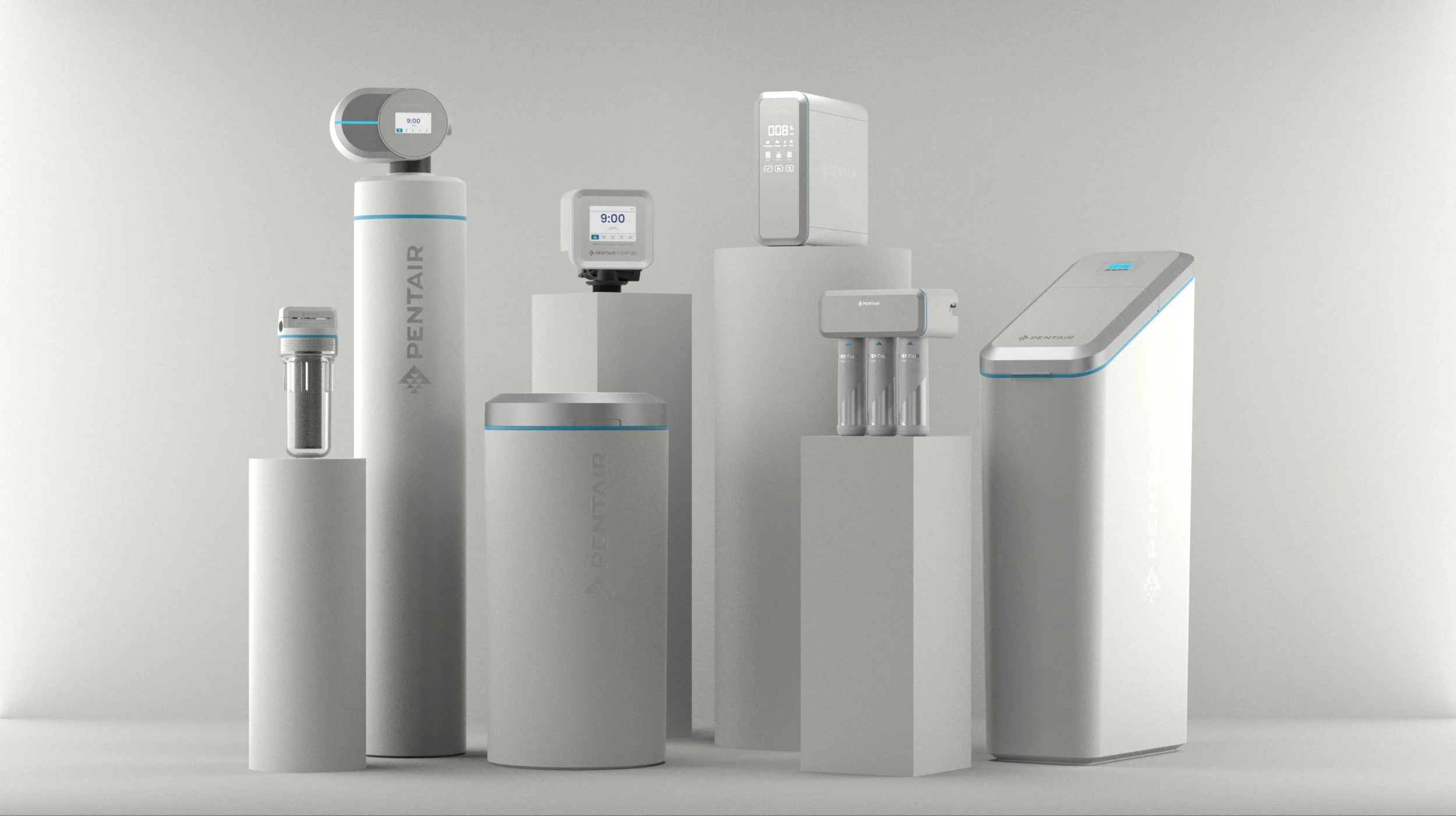
Adopted VBL
Pentair faced significant challenges in creating a cohesive visual identity across its expansive product portfolio. The existing offerings, while innovative and functionally robust, lacked a consistent aesthetic, resulting in brand fragmentation and a diluted market presence. Each segment had developed independently, leading to a visual disconnect that not only confused consumers but also hindered the brand’s ability to stand out in a crowded marketplace.
The challenge was to unify these diverse products under a single, coherent visual identity without sacrificing the unique functionality and usability that each product demanded. Furthermore, the new VBL needed to resonate emotionally with consumers, conveying the Pentair brand story while supporting the company’s commitment to innovation and sustainability.
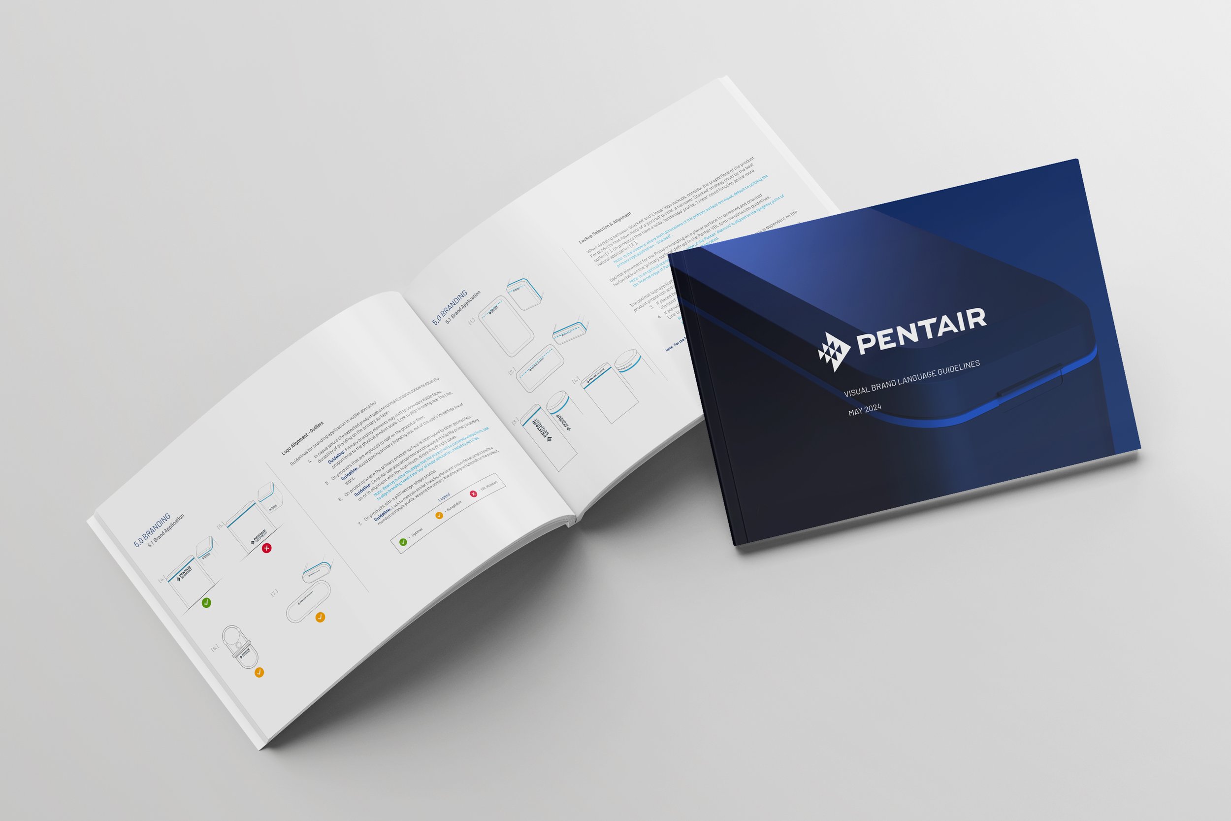
Translating Brand Values Into Design Methodology
To overcome these challenges, Pentair embarked on a comprehensive design initiative to develop a VBL that would serve as the visual embodiment of the brand’s purpose, mission, and values. The solution involved an in-depth exploration of Pentair’s brand attributes—like confidence, authenticity, and purposefulness—and translating these into visual reference boards with descriptive elements that could be applied consistently across all product lines and digital interfaces.
Research + Inspiration
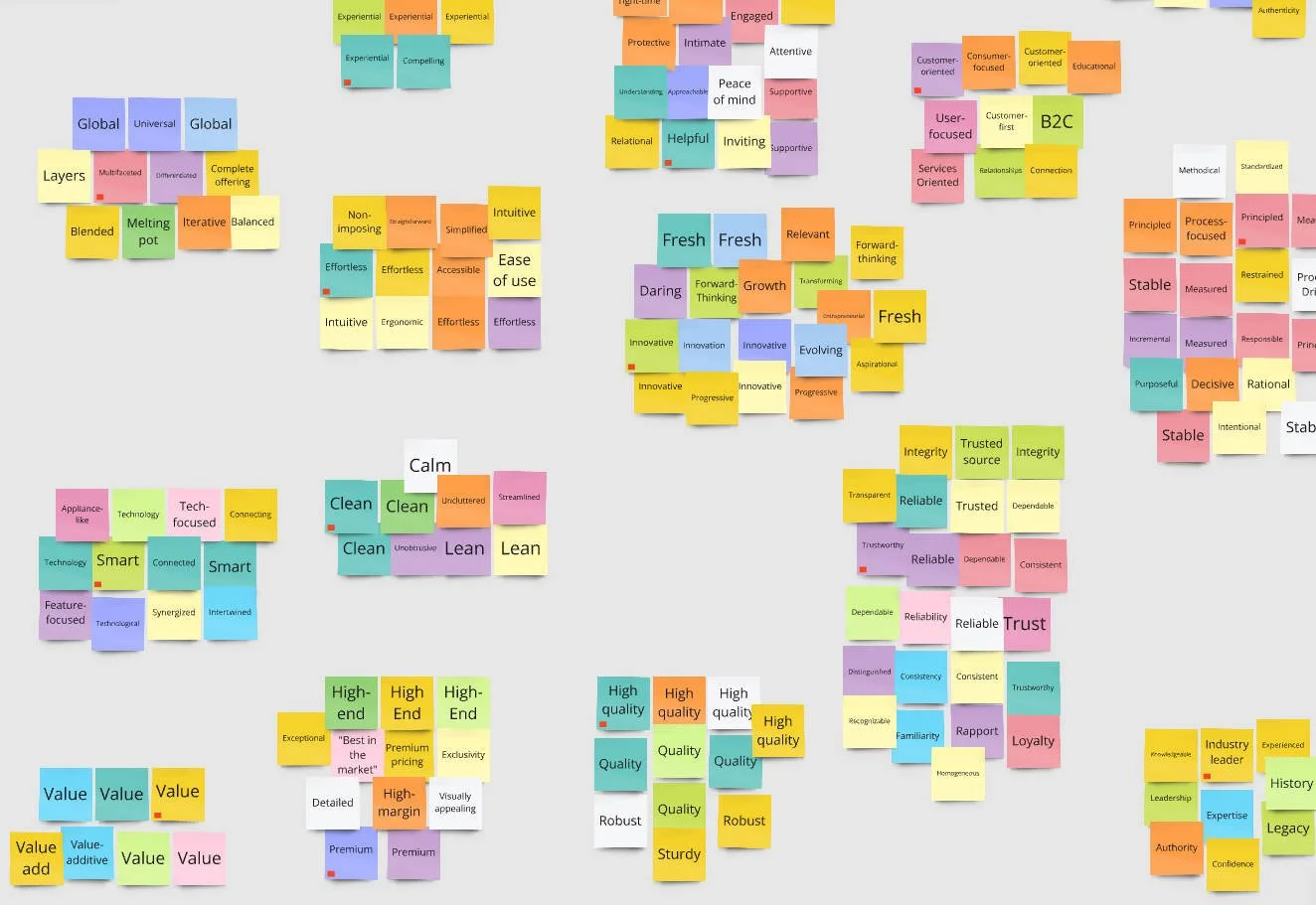
A critical component of the project was comprehensive stakeholder research. Virtual interviews were conducted, and the insights gathered from these interviews provided a deeper understanding of Pentair's current brand positioning and the desired direction for future development. Key quotes from stakeholders highlighted the need for a clean, water-inspired color scheme and a design approach that harmonizes across global markets.
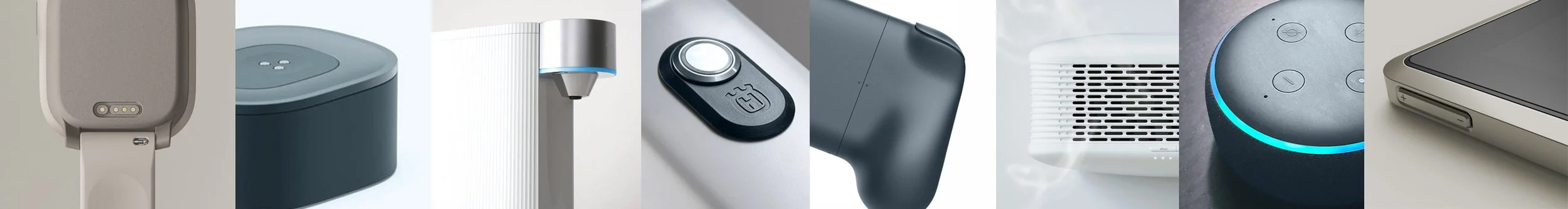
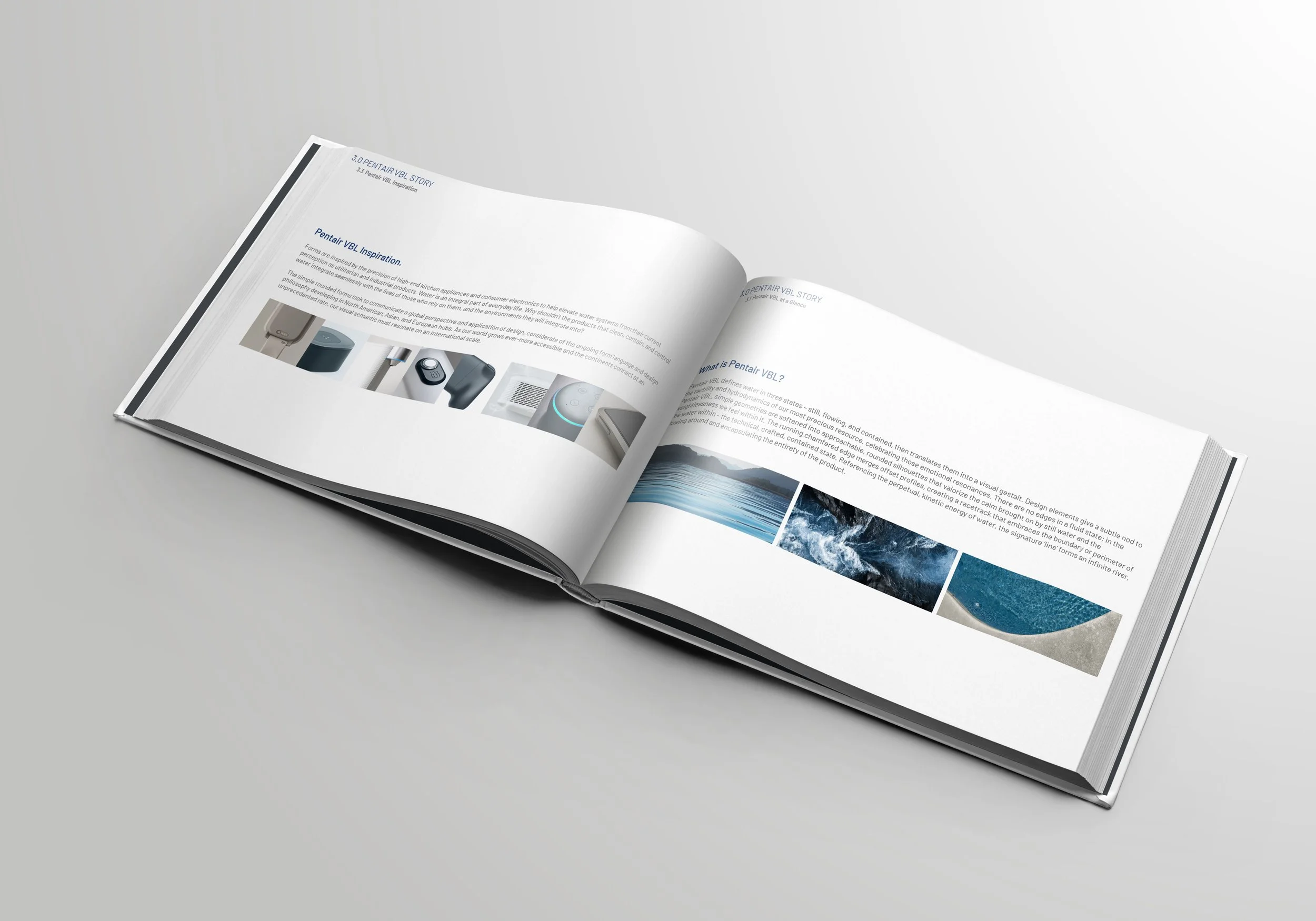
Inspiration was drawn from a wide range of sources, including nature, architecture, and technology, reflecting Pentair’s connection to water and its commitment to innovation. The team also explored the environments in which Pentair’s products are used, such as residential spaces, commercial kitchens, and industrial settings, to ensure that the new VBL would be both relevant and impactful in real-world contexts.
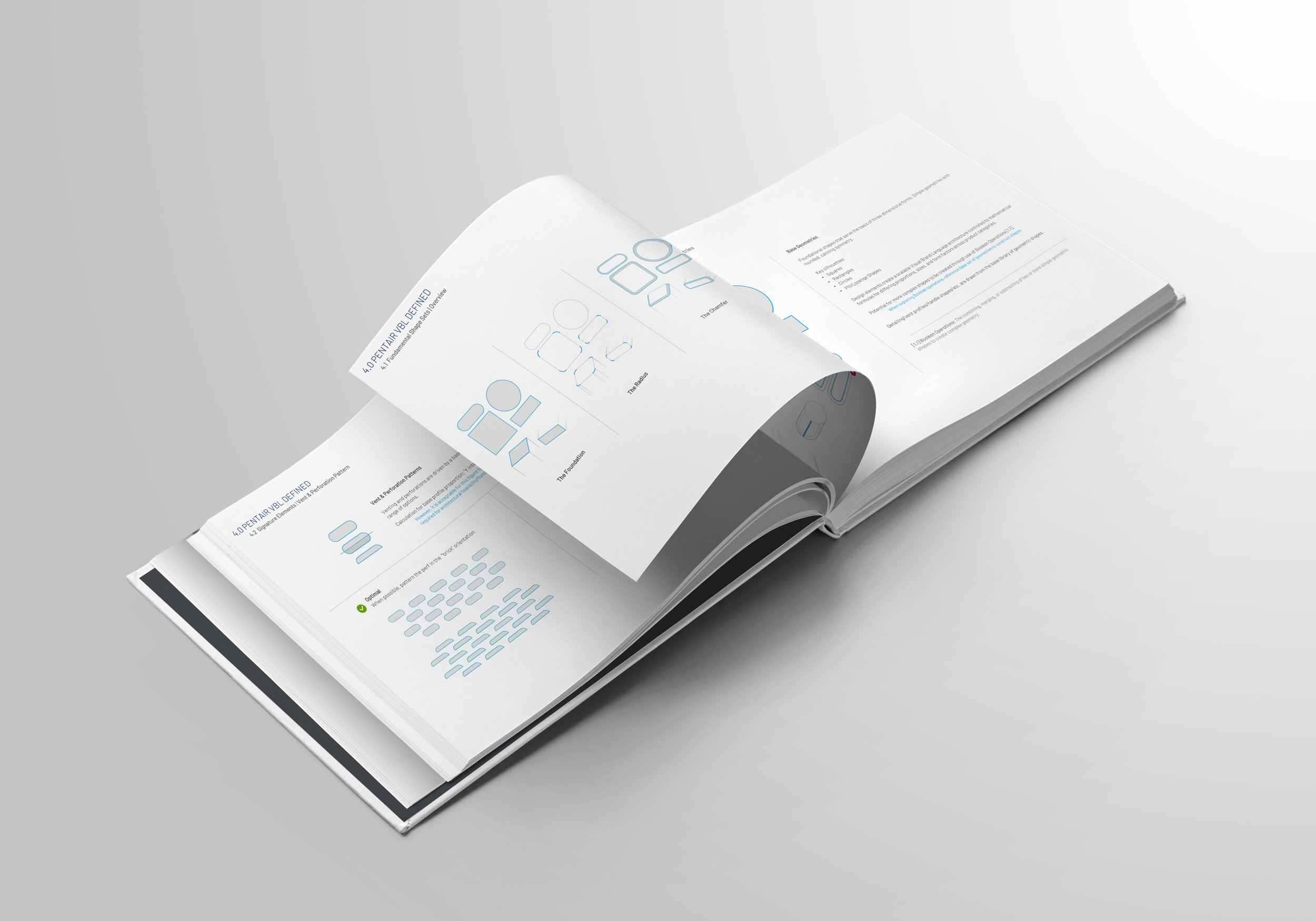
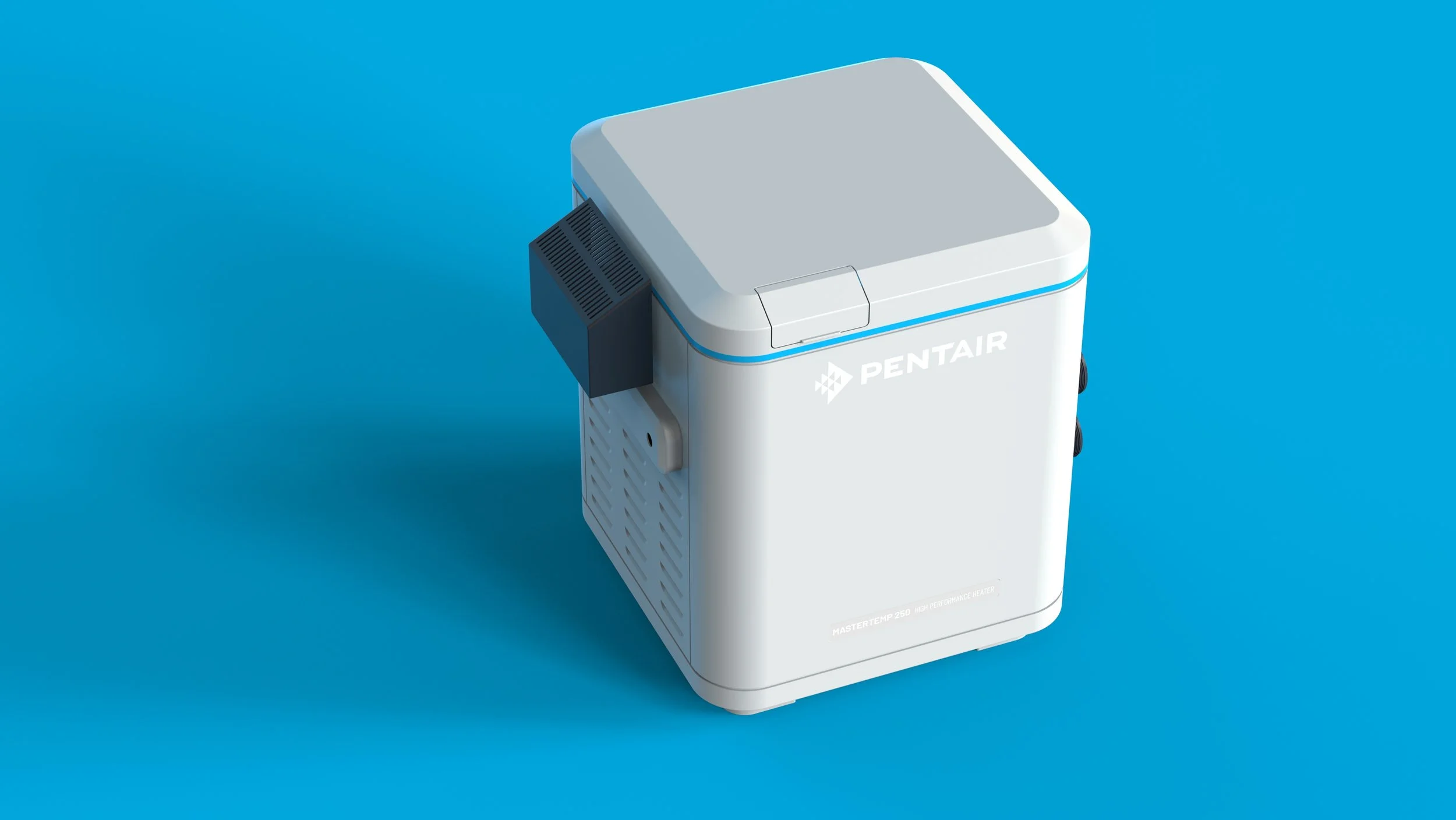
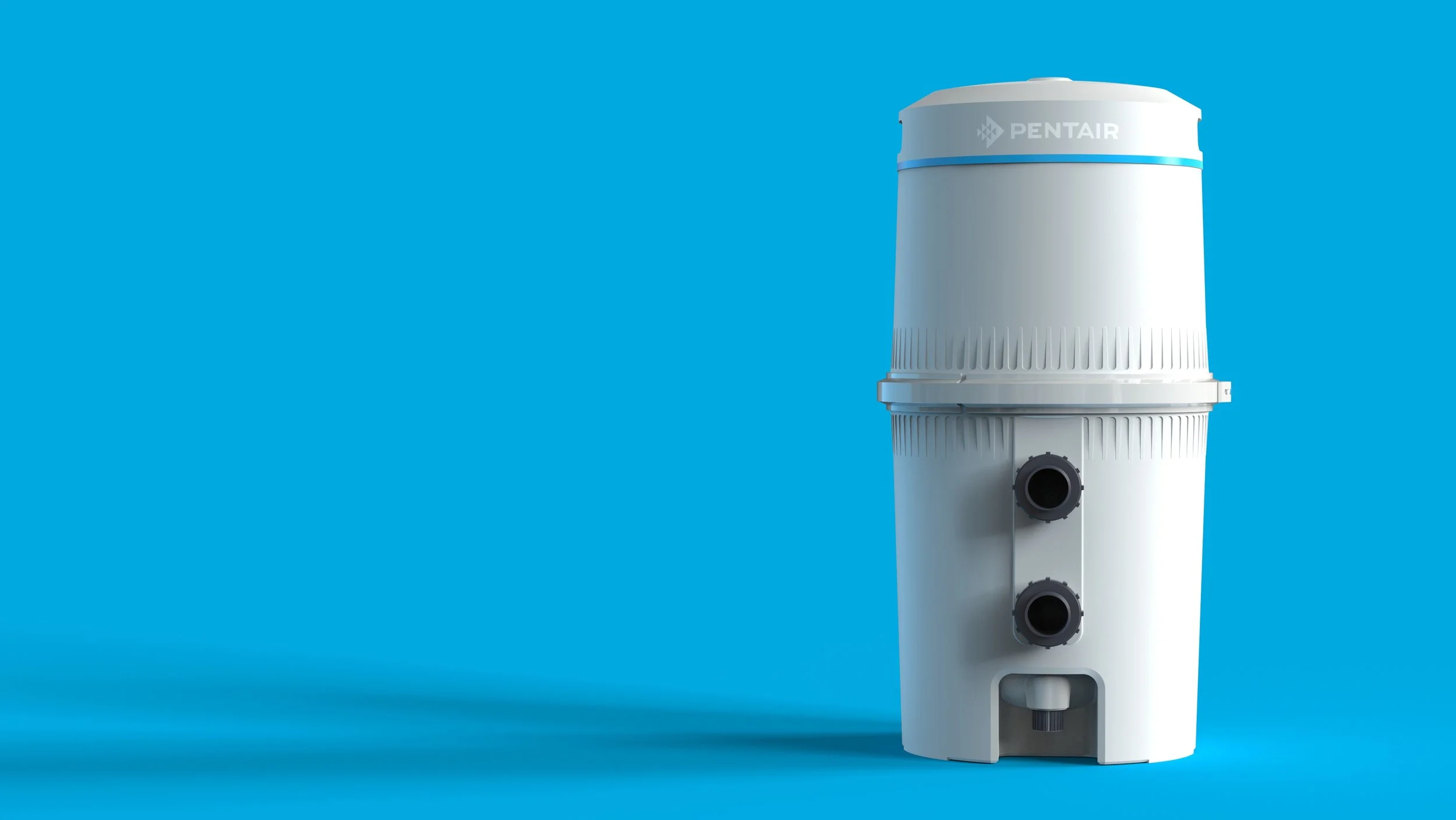
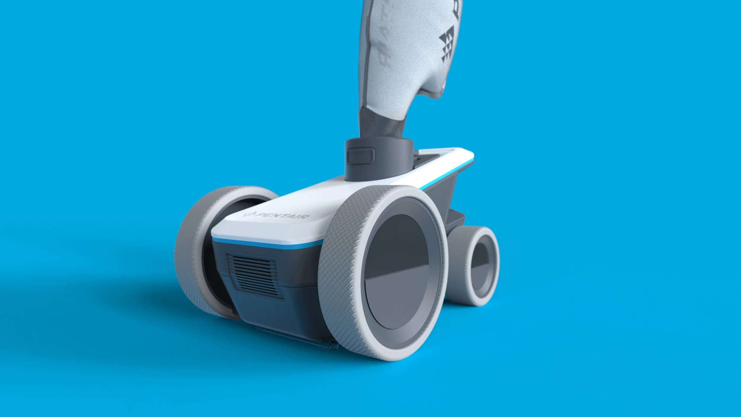
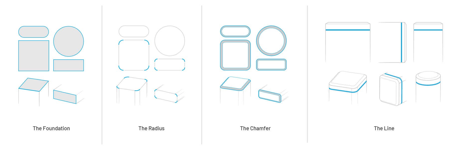
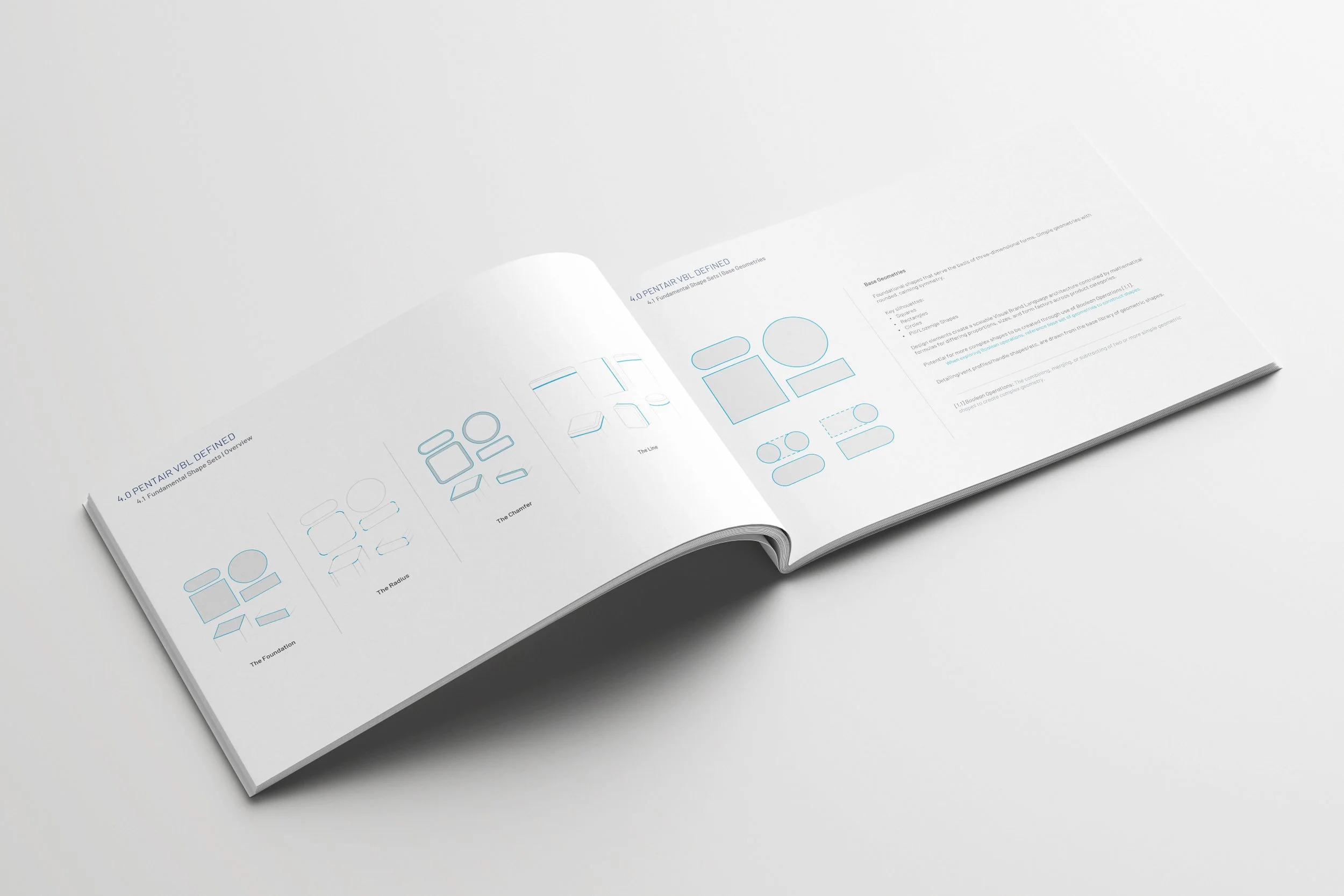
Form and Proportion
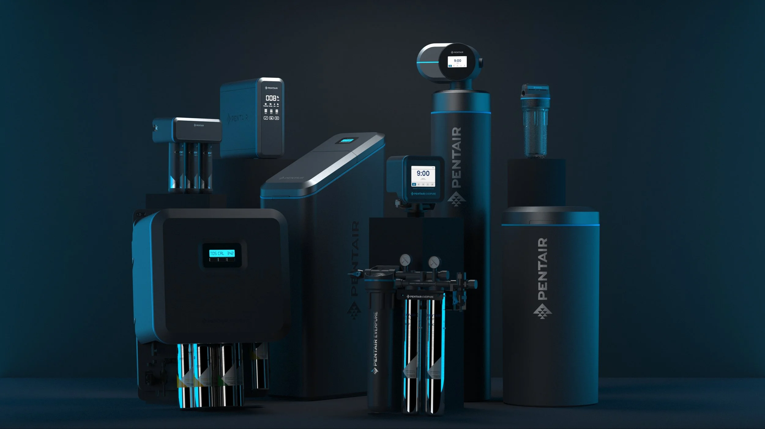
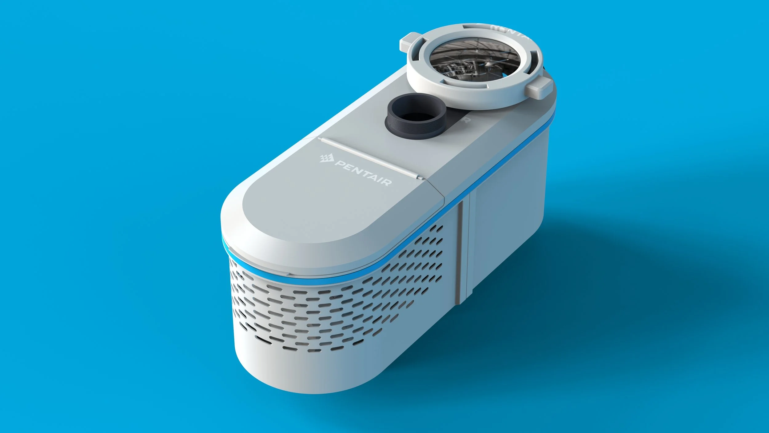
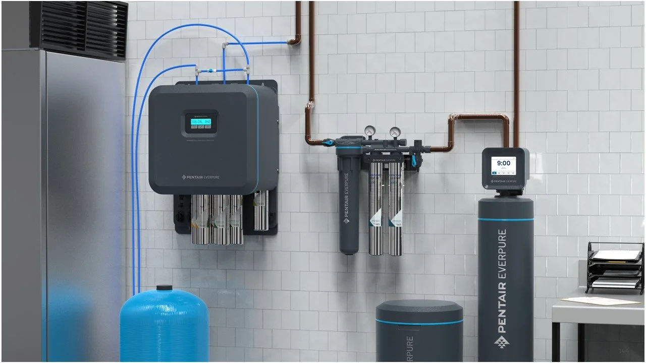
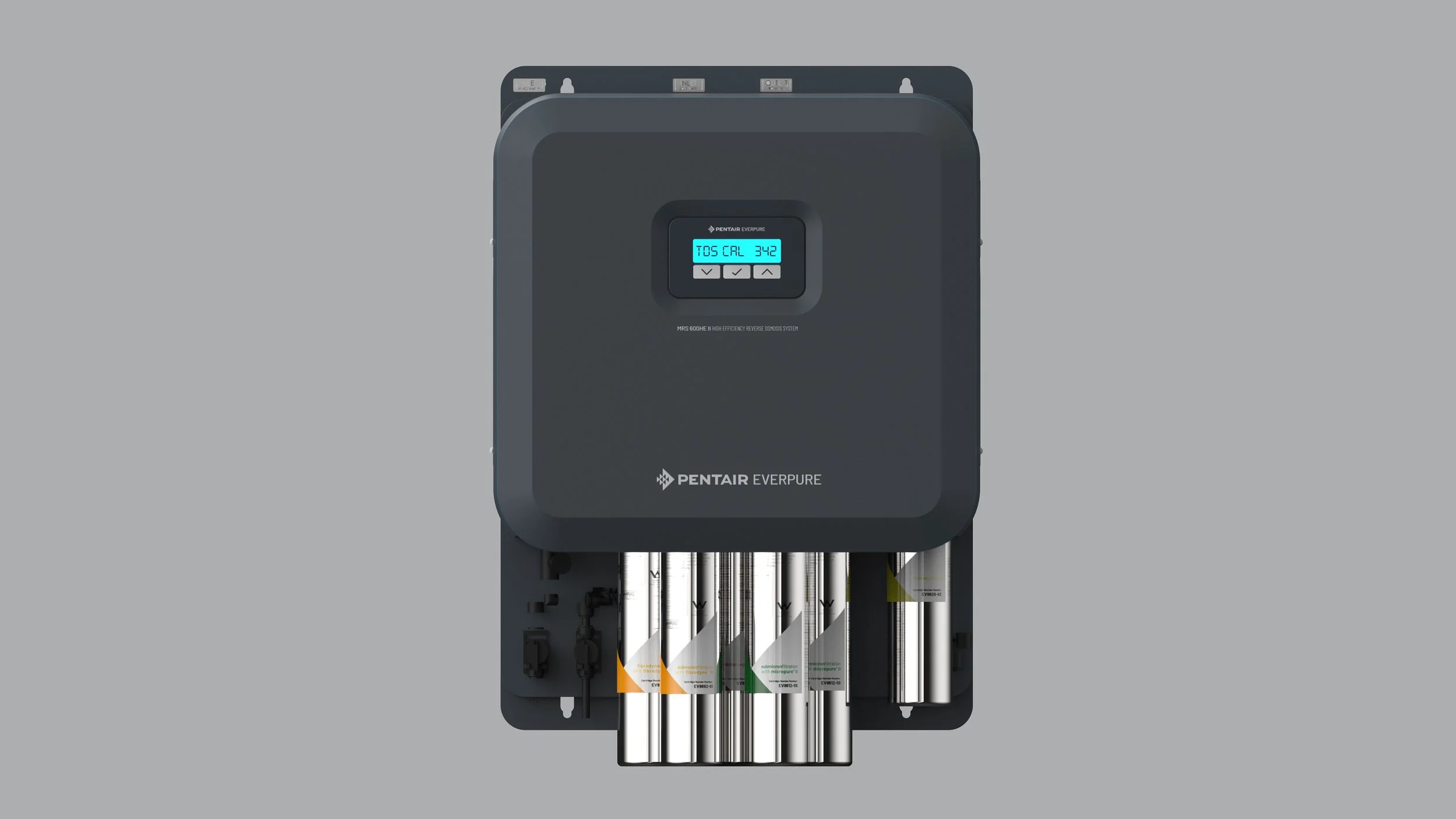
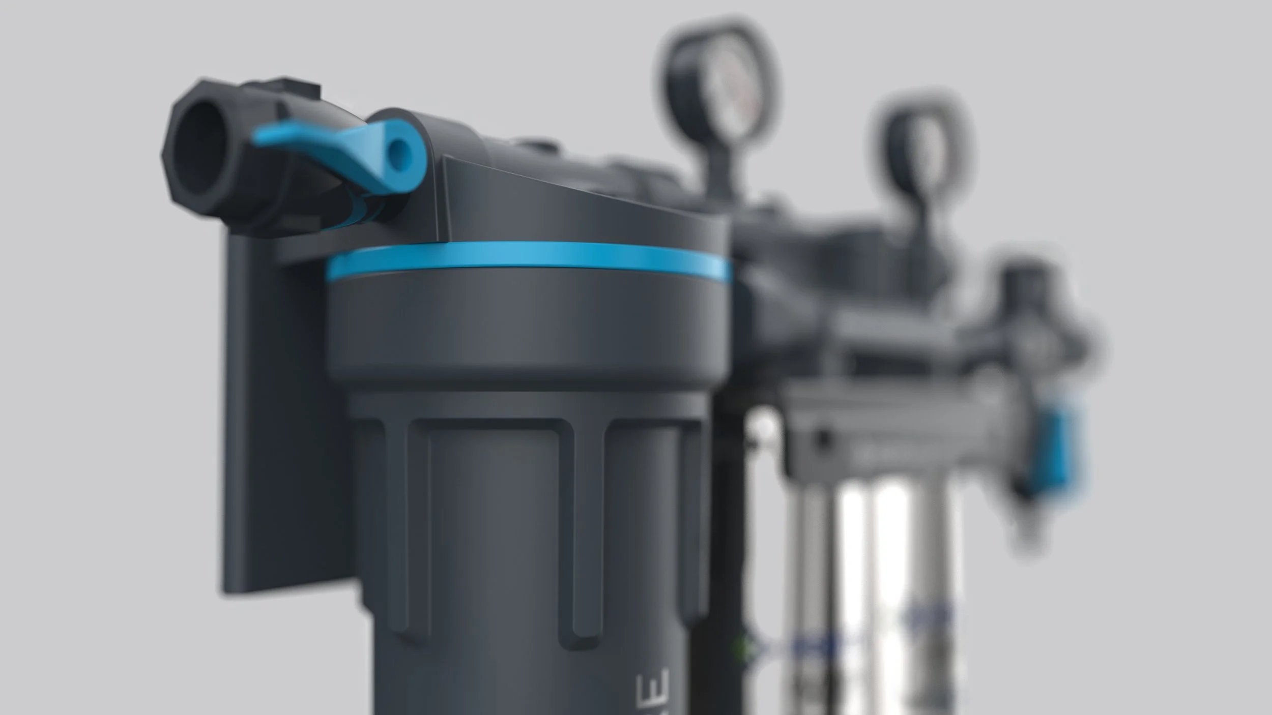
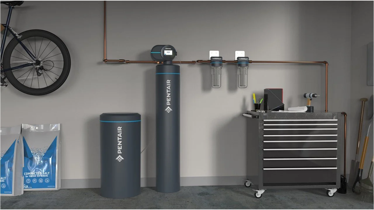
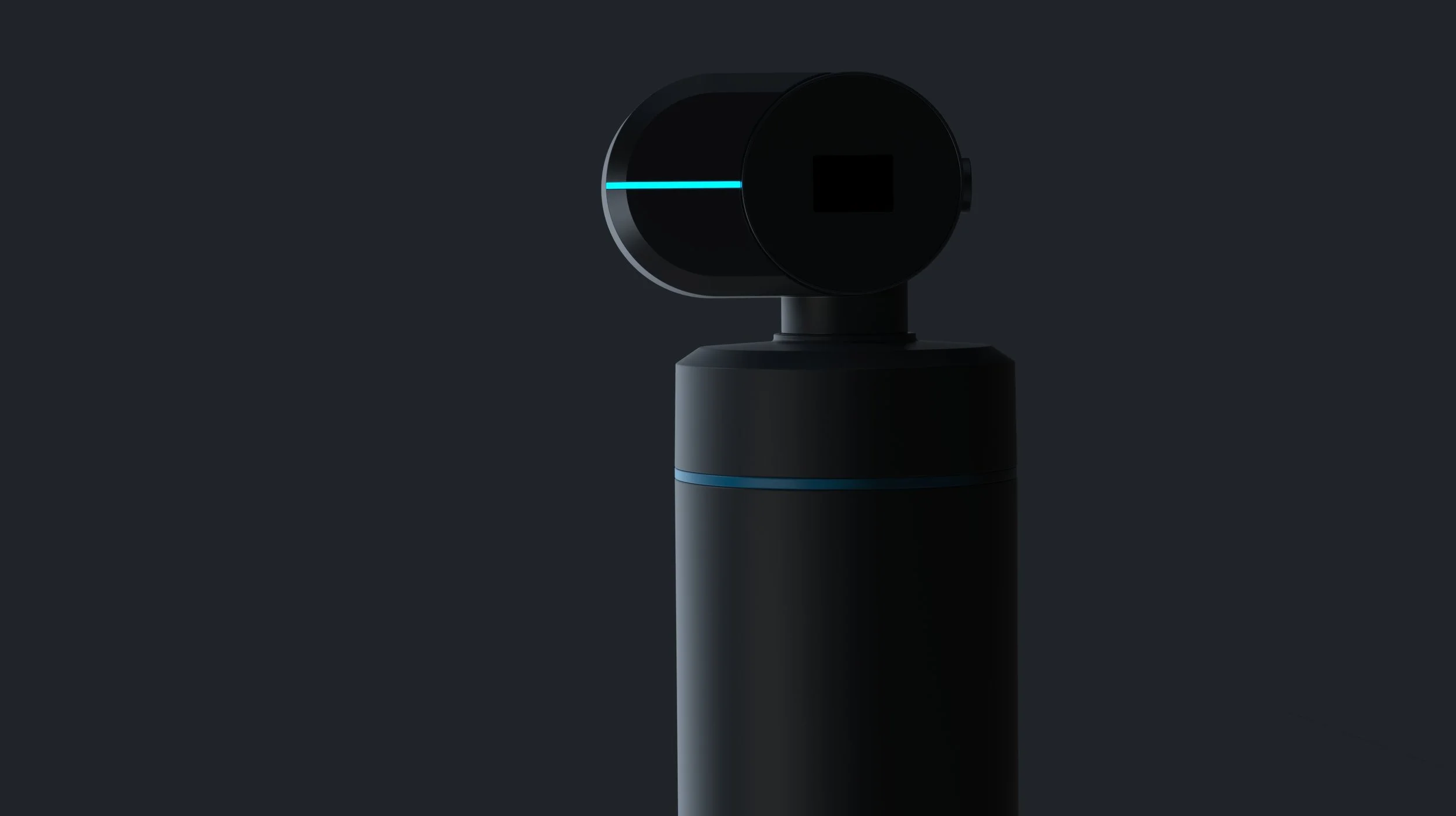
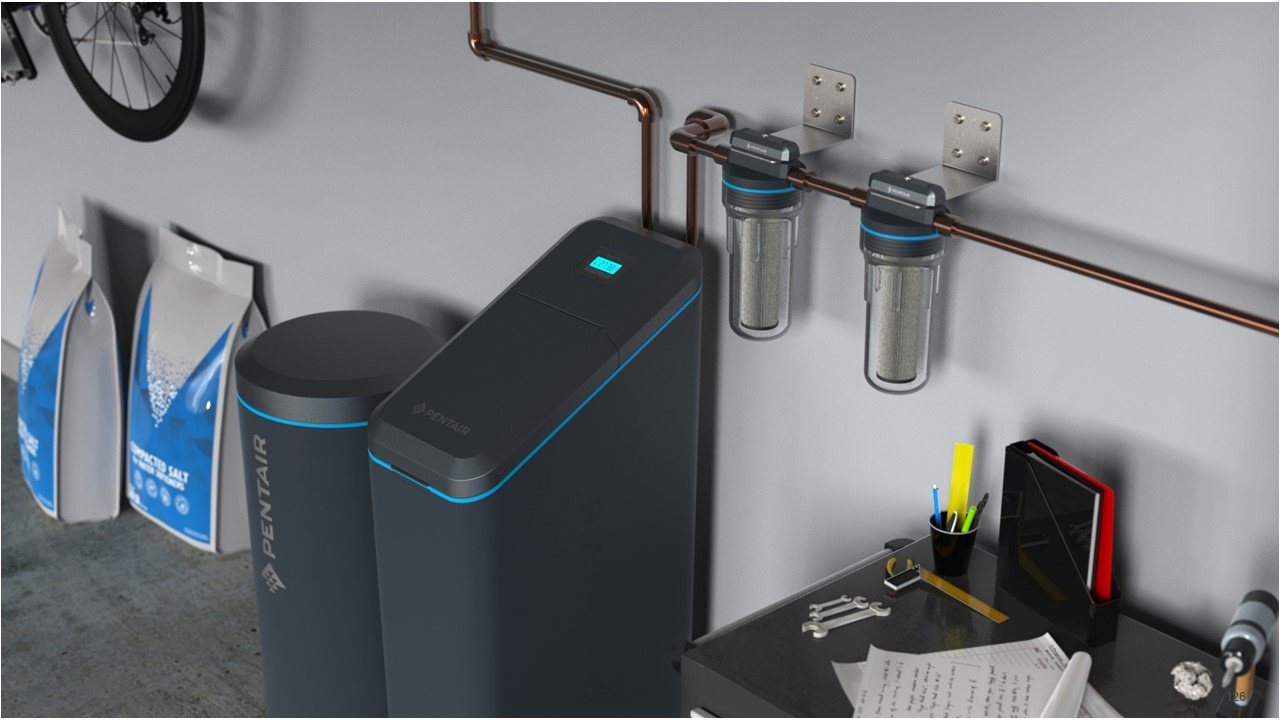
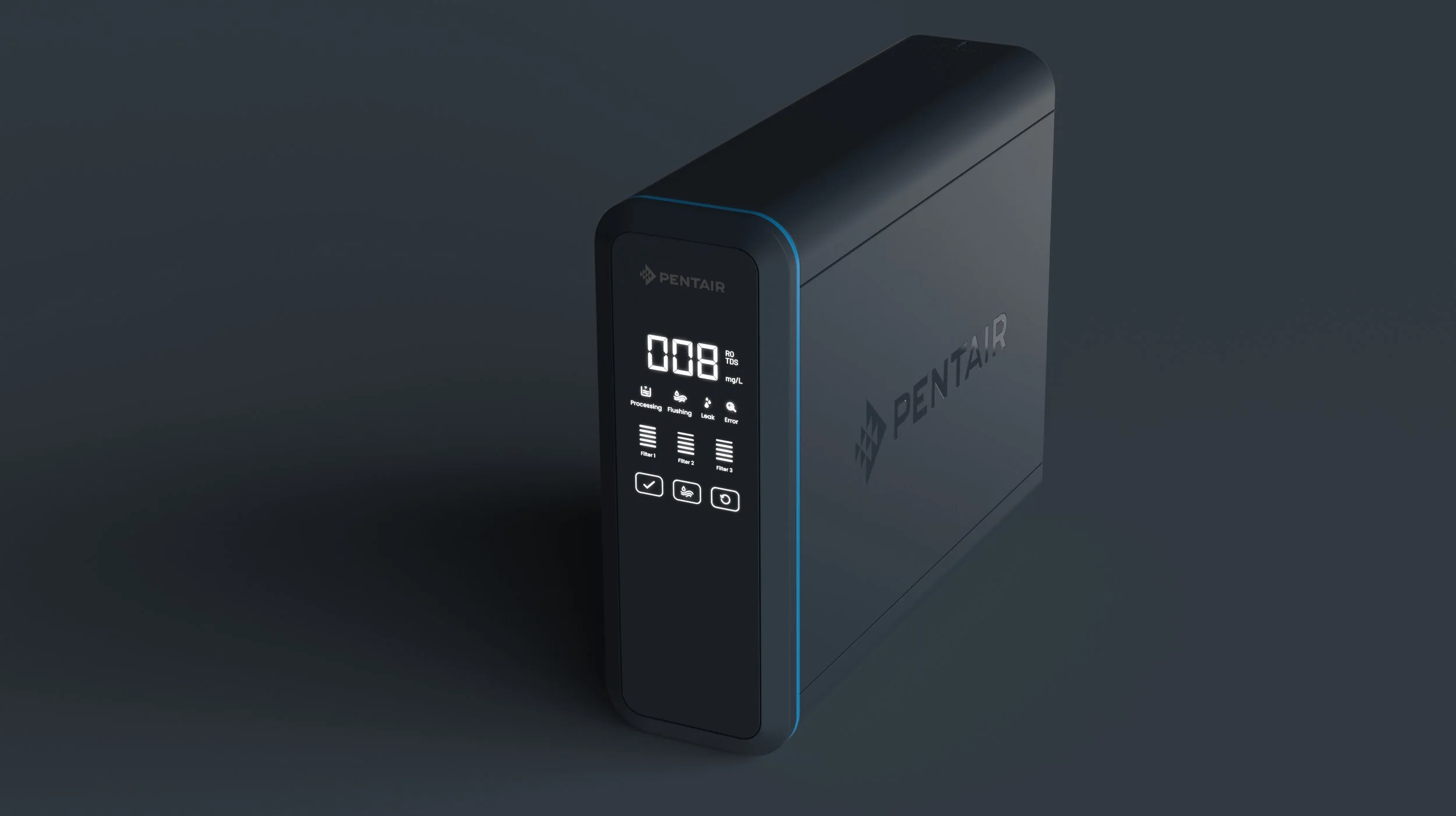
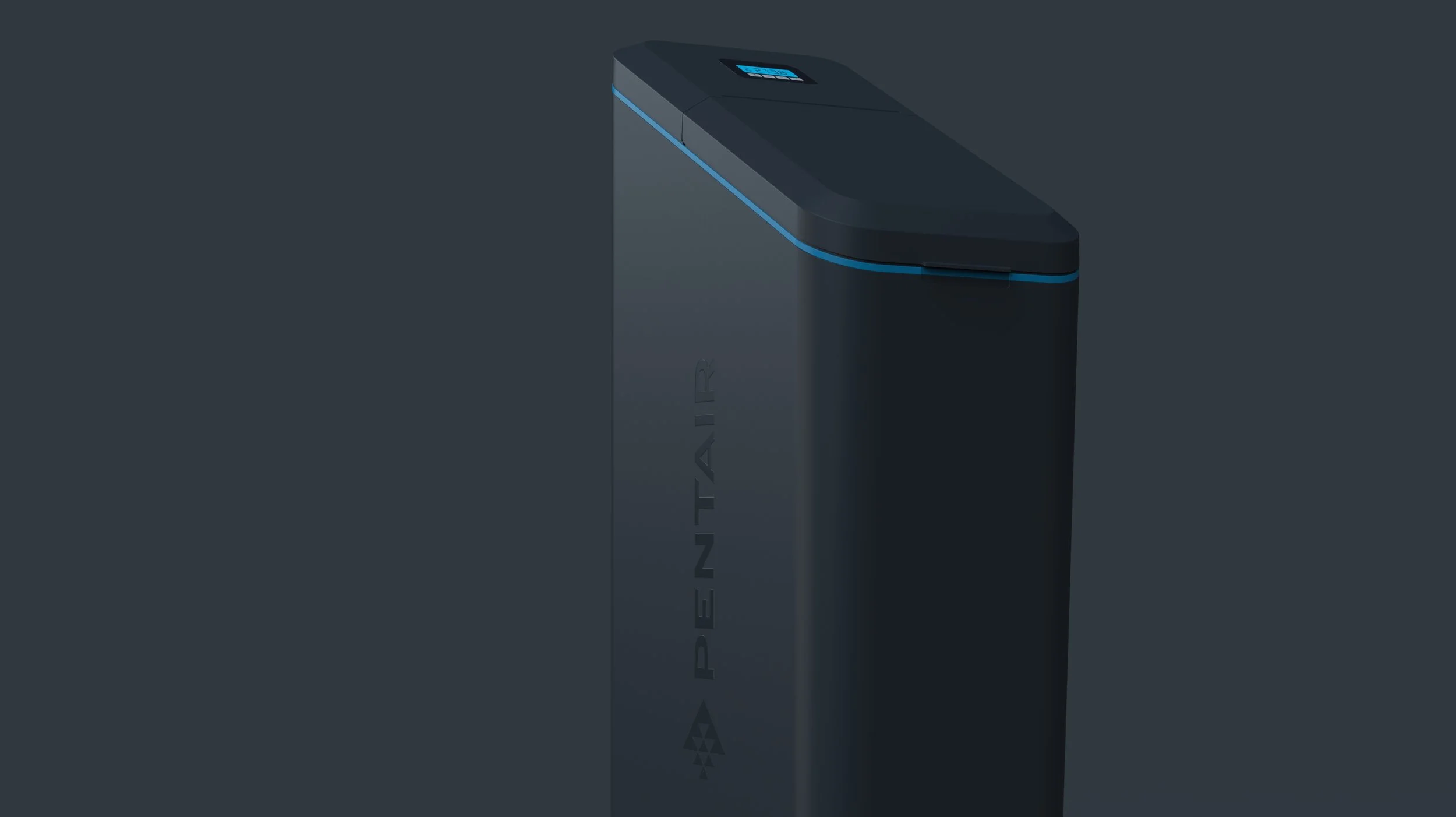
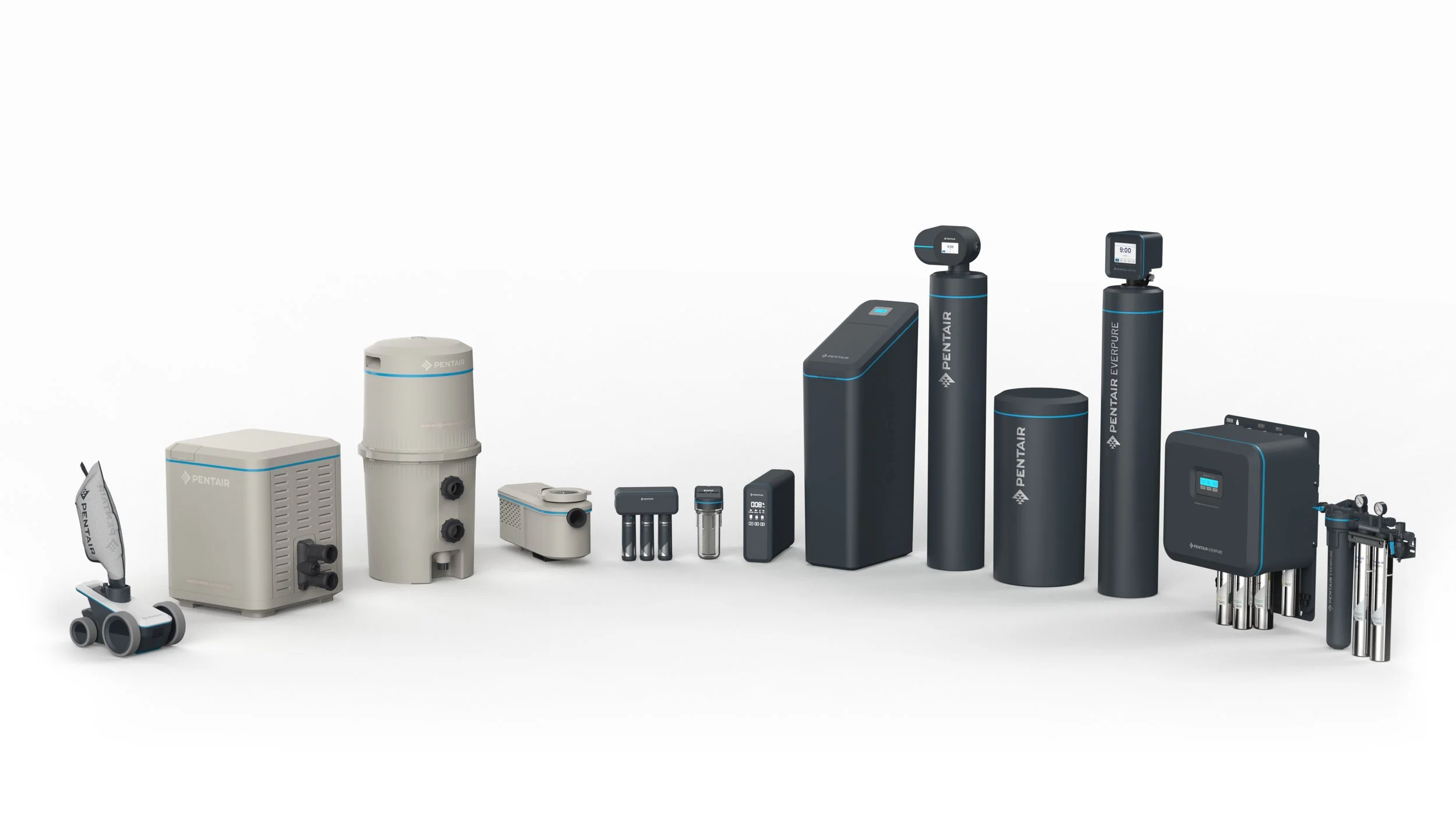
The new VBL introduced simple, geometric forms softened into approachable, rounded silhouettes. This design choice was inspired by the calmness and fluidity of water—a core element of Pentair’s identity. The rounded forms not only conveyed a sense of tranquility but also served to reduce the visual clutter in environments where Pentair products are typically used, such as pool pads, commercial kitchens, and residential spaces. This harmonious blend of form and proportion was carefully calibrated to ensure that the products were not only visually appealing but also functional and easy to use.
Color | Material | Finish
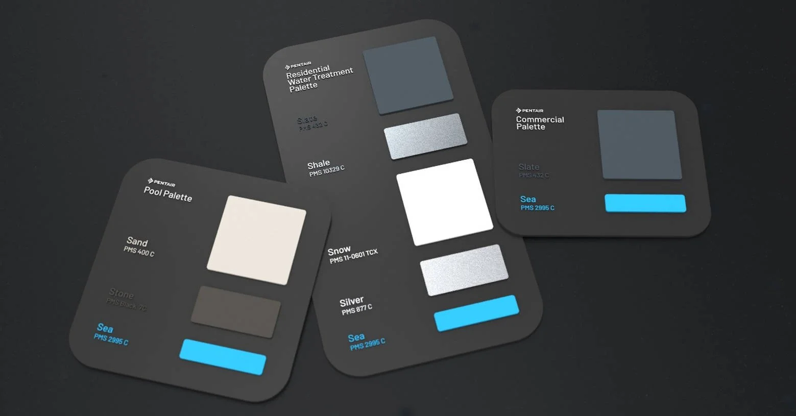
The IN2 design team developed distinct color palettes tailored to the specific needs of each product segment. For pool products, the ‘Sand,’ ‘Stone,’ and ‘Sea’ palette was chosen to evoke natural elements, creating a connection between the product and its environment.
For residential water solutions, the ‘Slate’ and ‘Snow’ palettes were selected to convey a sense of purity and modernity. These color choices were paired with carefully selected materials and finishes that enhanced the products' durability and performance while also contributing to a cohesive and premium aesthetic. The CMF strategy was pivotal in ensuring that each product stood out in its respective market while remaining aligned with the overarching Pentair brand identity.
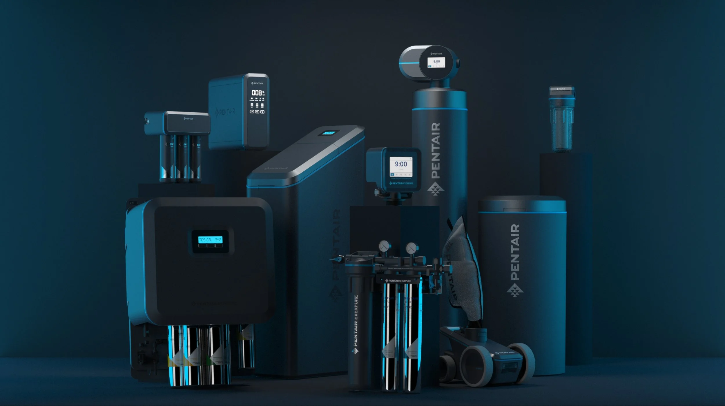
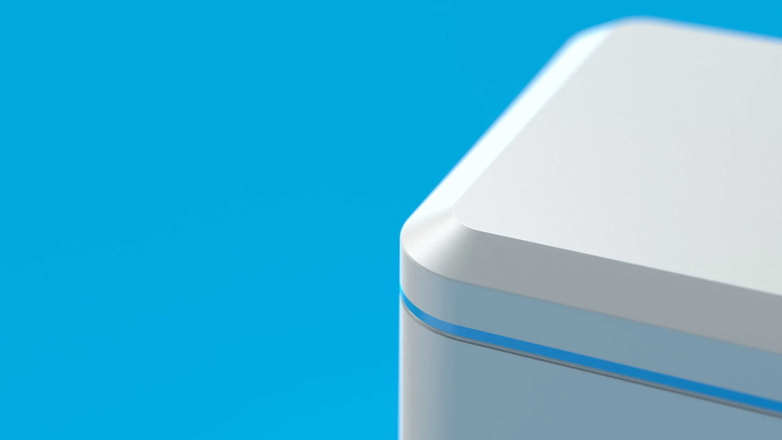
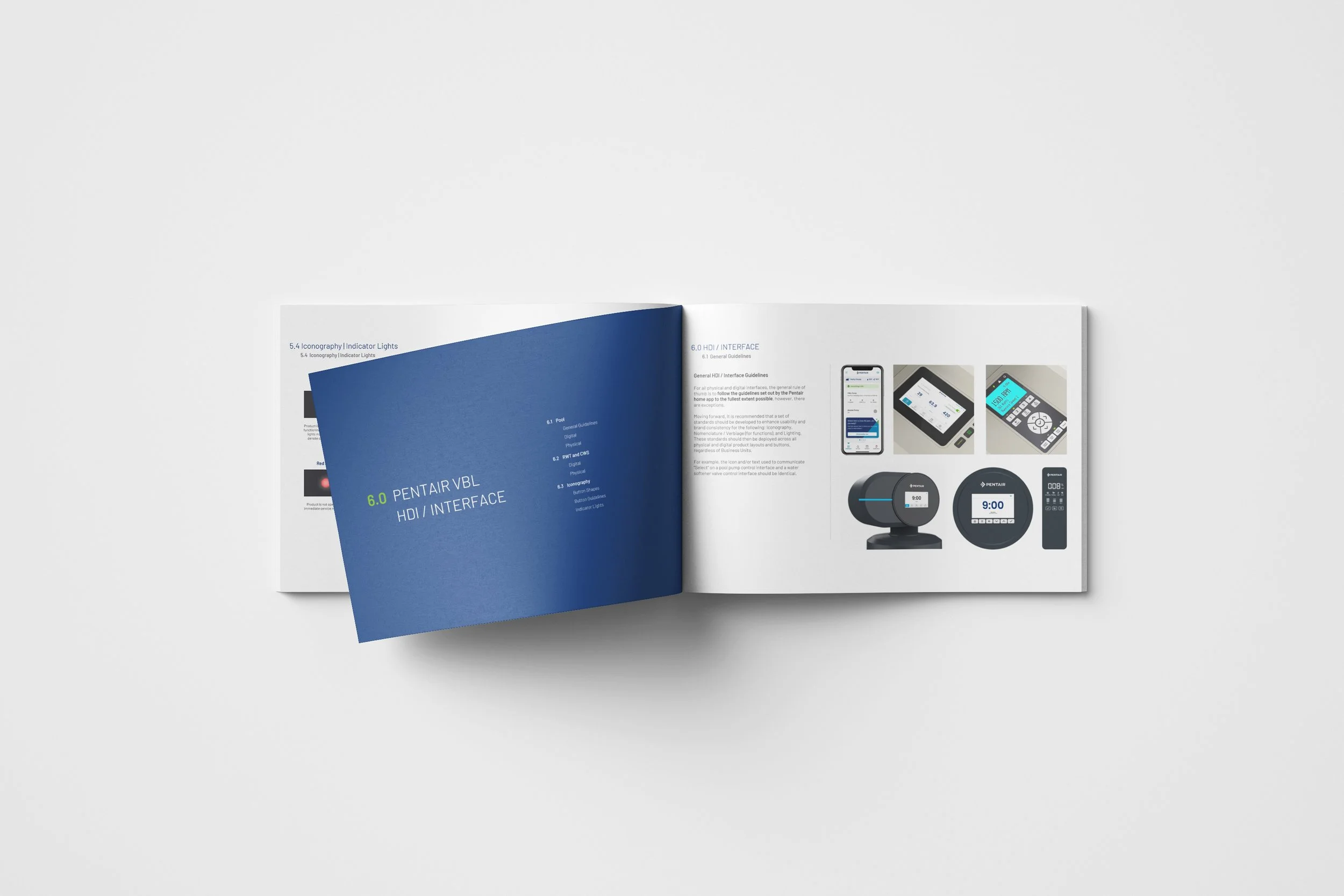
Signature Elements
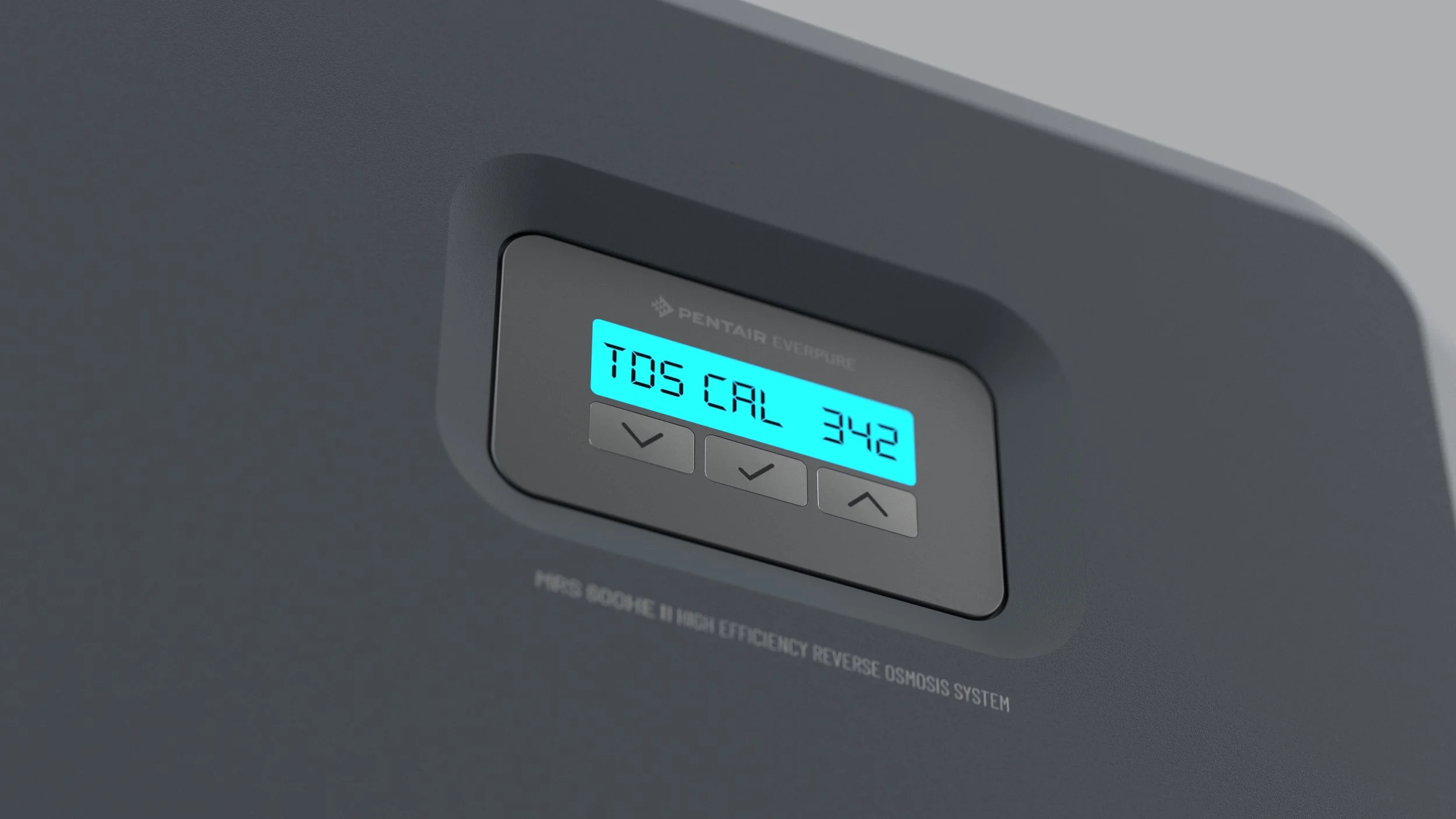
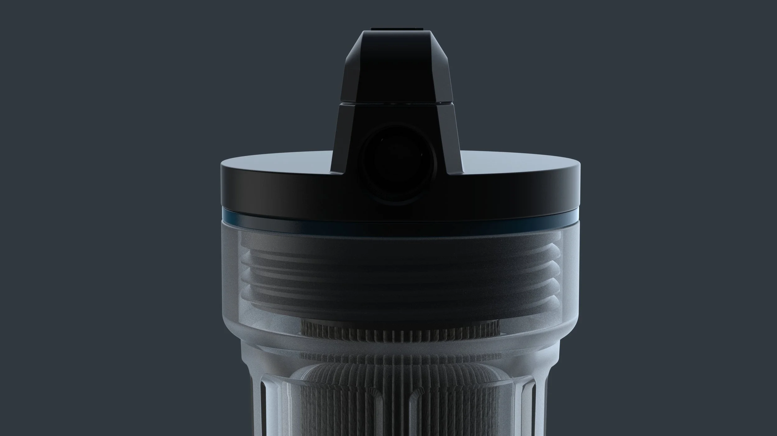
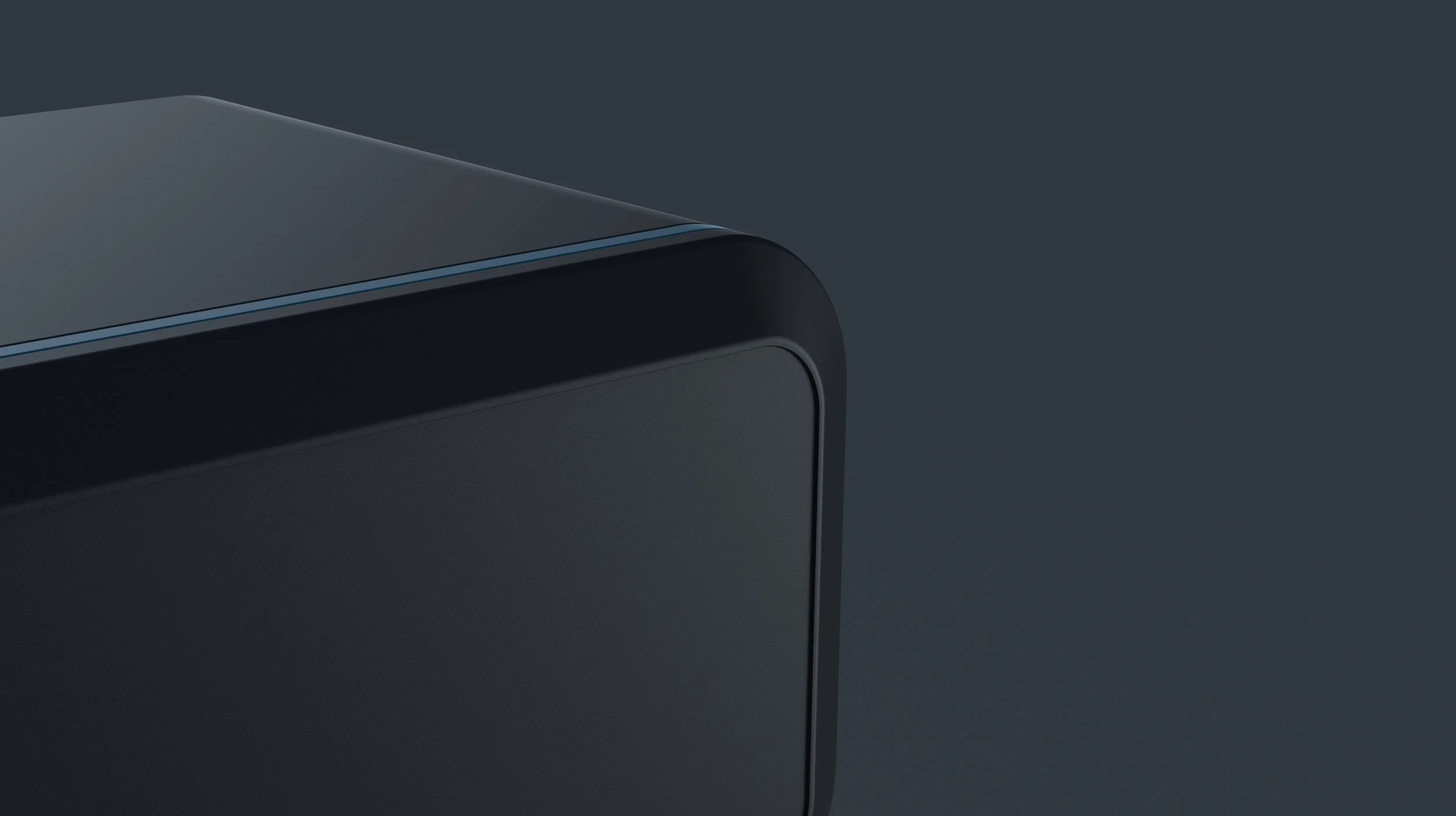
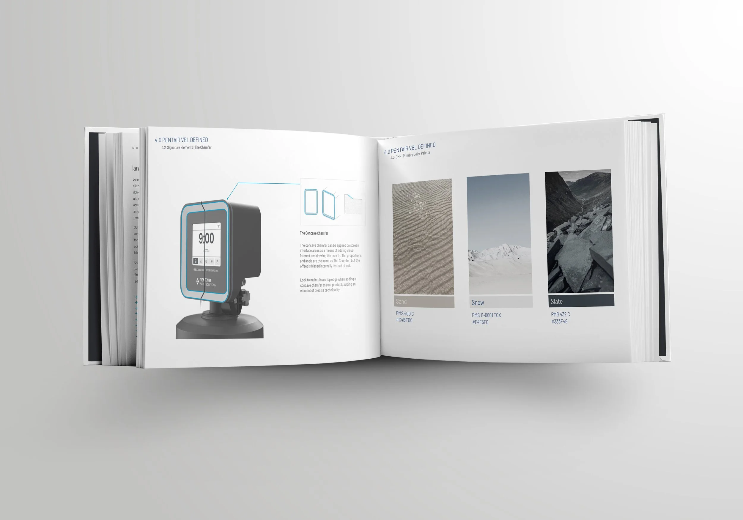
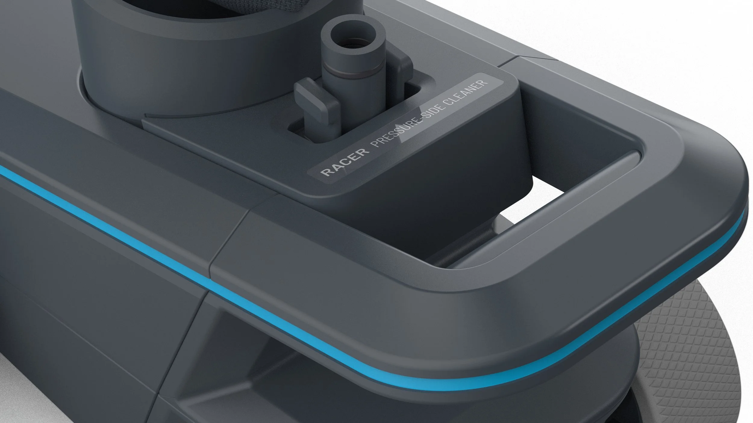
Two signature design elements—the running chamfer and the signature line—were introduced to add a distinctive touch to Pentair’s products. The chamfer, a subtle bevel along the edges of the products, creates a sense of visual lightness, making even robust products appear sleek and refined.
The signature line, representing the continuous and flowing nature of water, encompasses the form, providing a visual thread that ties the entire product range together. These elements were carefully integrated to enhance the products' aesthetic appeal while also serving as a subtle reference back to Pentair’s connection with water and commitment to innovation.
VBL Impact
By creating a cohesive and recognizable visual identity, Pentair created an opportunity space to differentiate itself from competitors, strengthen consumer trust, and foster brand loyalty. The unified VBL provides a strong foundation for continued innovation, enabling Pentair to respond quickly to changing market demands while maintaining a consistent and premium brand presence.
Furthermore, the flexibility of the VBL allows for future growth and adaptation, ensuring that Pentair’s visual identity remains relevant and impactful as the company evolves. The VBL’s success is evident in the enhanced consumer experience, with products that are not only functional and high-performing but also visually appealing and emotionally resonant.
The development and implementation of Pentair’s new Visual Brand Language represents a significant achievement in the company’s ongoing mission to lead in the water solutions market. By creating a unified and emotionally engaging design language, Pentair has successfully bridged the gap between its diverse product offerings and its overarching brand narrative.